Using ‘text-wrap: balance’
I demonstrate the effect of enabling text-wrap: balance for titles and headings across onlyrss.org.
Background
If you're reading this then you are probably already aware of the upcoming new CSS feature:
text-wrap: balance;If not, then please visit the Chrome dev blog for the full details.
Basically, it's a way to "balance" titles, headings, and short paragraphs such that there are a similar number of words per line (and hence avoid widowed words). For simplicity, I'm going to refer to it as CSS Balance from now on.
I'm not going to repeat the information that's available on the Chrome dev blog, the aim of this article is to demonstrate the effect of using CSS Balance on a typical blog, specifically this blog. Basically, I'm going to show some examples so you can decide if it's something you should implement on your website.
Examples
The following examples have not been configured specifically to demonstrate the effects of CSS Balance, they are simply the result of enabling CSS Balance on titles and headings on this website.
Homepage cards
Figure 1 below shows the first 3 cards from my homepage. Figure 2 shows the same 3 cards but with CSS Balance enabled.


As you can see, CSS Balance has had an effect on the titles of all 3 cards. The effect is probably most beneficial on the first card, where the words "Product" and "Manager" belong together, and on the second card, where the words "progress" and "bars" benefit from being together.
In total, 13 out of the 22 homepage cards have multiline titles, and each one of those multiline titles was altered when CSS Balance was enabled.
Where CSS Balance is probably most beneficial is in stopping scenarios like that shown below in Figure 3, i.e. where a single number has appeared on a line by itself. Although to be fair, a non-breaking space should probably have been used in this scenario to keep "Windows" and "10" together.

Article titles (Desktop)
I use a wider article page layout compared to the majority of blogs i.e. 840px, and I don't tend to use very long article titles. Because of this, my article titles typically only span a single line, and therefore CSS Balance has no effect when viewing my articles on a typical desktop.
Article titles (<Desktop)
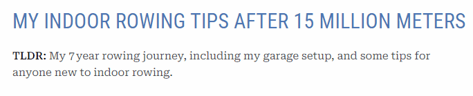
Once you view articles on something narrower than a typical desktop display, the situation is very different.

In Figure 4 above, where CSS Balance is NOT enabled, we see that as the viewport width is reduced, the last word on the first line simply drops to a new line, as you would expect. This is a good example of why CSS Balance is useful, without it "meters" becomes disconnected from "million", which then becomes disconnected from "15".
With CSS Balance enabled (Figure 5 below), there is far less movement of the title as the viewport width is reduced, and the phrase "15 million meters" remains together.
Summary
So, should you enable CSS Balance on your website? Yeah, why not, it's literally 1 line of CSS. It's easy to enable it for your website (you'll need to try it in a canary build of Google Chrome) and then see if you like the effects. I'll be leaving it enabled on onlyrss.org, and will wait for browsers to add support.